Moodboards get a bad rap. Either they’re too vague to be useful, or so detailed they start looking like final designs. But when done right, a moodboard can be one of the most helpful (and overlooked) steps in any creative process—especially in game UI, branding, and animation.
At The DeXigner, we build moodboards at the start of almost every project. Not because it’s trendy, but because it makes the rest of the work smoother, faster, and more collaborative.
Here’s how to make one that actually helps—not hurts—your creative momentum:
1. Start with the why, not the aesthetic.
Before you drop a single image in the frame, ask: What is this board trying to solve?
Is it to align on vibe? Sell a direction to your team or client? Capture the tone of the UI? Nail the visual feel of a character or trailer? Your answer determines what kind of board you’re making, and who it’s for.
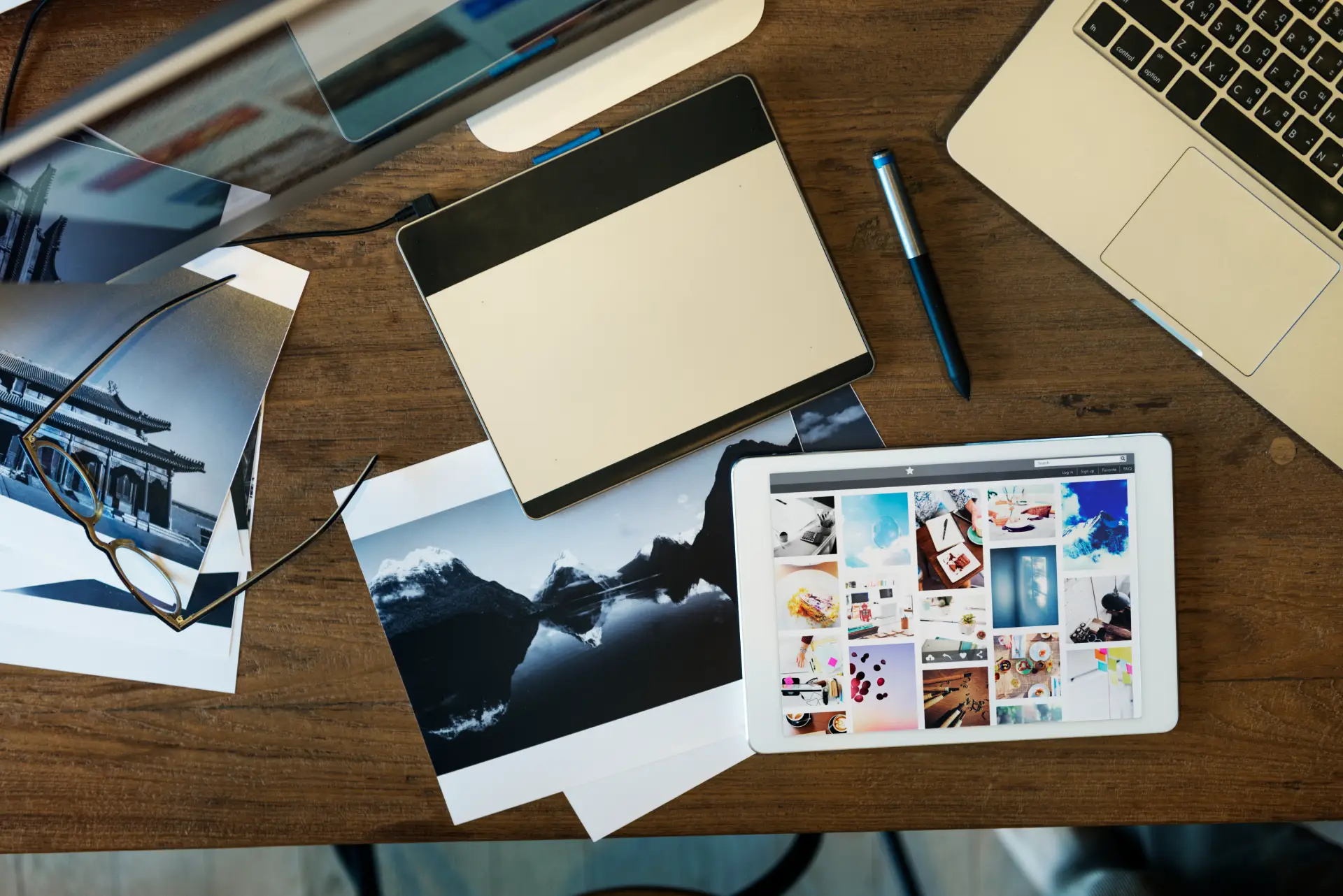
2. Curate, don’t collect.
This isn’t a scrapbook. A strong moodboard is edited and intentional.
We aim for 6–10 images max per moodboard section. If it’s for a game UI, we might show type treatments, color palettes, button styles, and a few HUD shots that demonstrate hierarchy and flow. For branding? We look at logo examples, typography, visual tone, and maybe even packaging or deck slides.
If an image doesn’t help clarify direction, it’s out.
3. Show range within a direction.
You don’t need to pick a single visual style just yet, but you do want to cluster similar looks to help your client or team make comparisons.
For example: “Option A leans more gritty and high-contrast, while Option B is brighter and cel-shaded.” Group your reference images accordingly. This makes conversations around alignment much easier.
4. Add notes (your future self will thank you).
We always label our moodboards. A quick note on why we picked something helps a lot, especially if you revisit the board days later or hand it off to someone else.
“This type style feels minimal and techy, and could work well for your settings screen.”
“This illustration captures the kind of energy we want in the cutscene animation.”
“This color scheme balances approachability and sci-fi.”
Even just a sentence or two can prevent entire feedback loops later on.
5. Don’t treat it like gospel.
A moodboard is a compass, not a contract.
It’s okay to deviate once you get into real design work. The point is to start with shared clarity, not perfection. The best moodboards are the ones we revisit later and say, “Yep, this helped us get there.”
Bonus: Our Favorite Tools
- Figma: Our go-to. Easy for team comments and real-time collaboration.
- Milanote: Great for collecting inspiration across different media (text, links, video).
- Are.na: More niche, but super handy for aesthetic research and art direction boards.
- Good old Google Slides: Works in a pinch. Especially helpful when working with clients who aren’t familiar with design tools.
Final Thought
Your moodboard doesn’t need to be perfect. It just needs to start the conversation.
Whether we’re working with an indie game dev or a startup founder, we’ve found the most successful creative projects always begin with visual alignment. And a strong moodboard? That’s the shortcut to getting there.
Ready to turn your idea into visuals that actually stick? Let’s make something.