Small teams often treat design like a last-minute add-on. But here’s the thing: the way your brand shows up visually—on your website, pitch deck, social, app UI—shapes how people perceive your product before they ever use it.
When everything looks and feels like it came from the same brain, you earn confidence. You look like you know what you’re doing. You seem “established,” even if you’re still pre-seed. And it doesn’t take a huge design team to pull this off.
1. Why Consistency Beats “Creativity”
Too many founders chase fresh ideas on every new project—new colors, new layouts, new vibes. But while variety is fun, it can also dilute your identity.
Consistency builds recognition. It makes you easier to remember. And when done right, it still leaves room to evolve without confusing your audience.
Think of it as creating a “brand rhythm.” Every touchpoint adds to the beat.
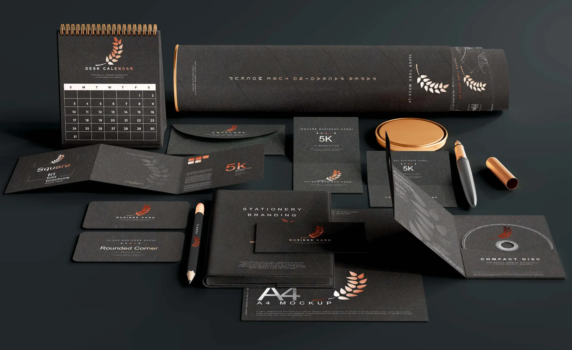
2. What Consistency Actually Looks Like
It’s not just about logos and color palettes. It’s about making deliberate, repeatable choices in your:
- Typography: Same font family across decks, websites, product, etc.
- Colors: A core palette, used in intentional ways (calls to action, section backgrounds, highlights)
- Tone of voice: Same energy across captions, slides, product copy
- Visual patterns: Repeating shapes, layout structures, icons, or illustration styles
- Motion/animation style: Yes, even the way your UI moves adds to your brand feel
3. Tools to Make It Easier
Even with a small team (or a solo founder), consistency can be baked in with a few smart steps:
- Create a mini brand guide, even a Notion doc works
- Use shared design systems or component libraries
- Build templates for decks, social posts, landing pages
- Set up brand kits in Canva or Figma so everyone’s pulling from the same toolkit
You don’t need 100 rules. Just enough to keep your team (and collaborators) aligned.
4. It’s Not Just About Looks—It’s About Trust
Visual consistency makes your product feel real. It makes you look reliable.
Investors notice. Users notice. Potential partners notice.
When your landing page feels nothing like your product UI or your social content feels off-brand from your pitch deck, it creates friction. People start to wonder if you’re still figuring things out.
But when it all hangs together? That’s when you start to feel like a brand.
You don’t need a rebrand. You need rhythm.
You don’t need to spend six figures or lock yourself into rigid guidelines. You just need clarity, tools, and a shared sense of what your brand is.
We help small teams build that rhythm, and keep it going as you scale. Start a brief with us.